
Immerse App
Developed as a fork from the Meta Training Hub, the Immerse App evolved into a commercial VR LMS product with real-world user deployment and integration with backend administration control.
Role
VR UX Designer
Target Hardware
Meta Quest 2/3, Pico Neo3/4
Industries
Education Technology / VR Learning Platforms
Date
Oct 2022 - Jun 2025
Problem
The Immerse App began as an offshoot of the work done for the Meta VR Training Hub. We set out to build something future-facing and flexible enough to serve as a general-purpose VR training LMS for clients across sectors.
At the core of the problem, most existing immersive systems didn’t scale or support much in the way of content hierarchies and reporting. Clients also needed a consistent way to theme the app to their brand. One key client had also expressed a strong interest in real-time multi-user collaboration for arranging scenes in VR.
My Role
I led the design for the VR frontend of the LMS. My work spanned:
Designing spatial UI layouts and panel behaviors that felt intuitive and comfortable in VR
Prototyping and validating interaction flows using ShapesXR to catch ergonomic or clarity issues early
Defining the logic for the theming system in Figma, then collaborating with developers to implement it in Unity via structured JSON
Scoping and iterating on all features, from collaborative scene editing and passthrough mode to UI tracking, session browsing, and general ergonomics
Working closely with engineers, PMs, and fellow designers to align the in-headset experience with backend logic and Admin-facing workflows

Process
The features the app needed to support evolved over time. This included varying types of authentication, guest access, passthrough for Mixed Reality (MR), theming, user positioned panels, and Collaborative Spaces (which was a major new section).
Early Exploration and Research
We reviewed enterprise LMS platforms, and I explored multilingual keyboard design, user-led spatial menu positioning, and theming systems. When useful, I tested different approaches in ShapesXR and headset builds to get a feel for panel positioning, different themes, and spatial comfort.
Prototyping and Interaction Testing
Using a combination of Figma and ShapesXR, I defined movement logic, menu transitions, and ergonomic layout. This included everything from trying out different panel layouts and sizes, to menu animations and typographic hierarchy.
Implementation
In Figma, I created the full UI flow for onboarding, session launch, authentication, and structured form interactions including states for Likert responses and dropdowns. These were tested and refined in VR, with guidance layers for first-time users. I also authored detailed JIRA stories covering component behavior, edge cases, and design refinements.
When we moved to support passthrough mode, we had to rework the design considerably. We could no longer rely on effects like background blur to support a glassy, semi-transparent style, due to system restrictions on the Quest at the time. This led to a more opaque theme with subtle use of gradients.
I worked closely with engineers on the theming pipeline, aligning Figma Variables with JSON outputs for Unity. I also coordinated with other designers to ensure alignment between the VR interface and backend dashboard views. Together we ensured that patterns like content status, filters, and icons remained consistent throughout the LMS.

Solution
Modular UI Panels:
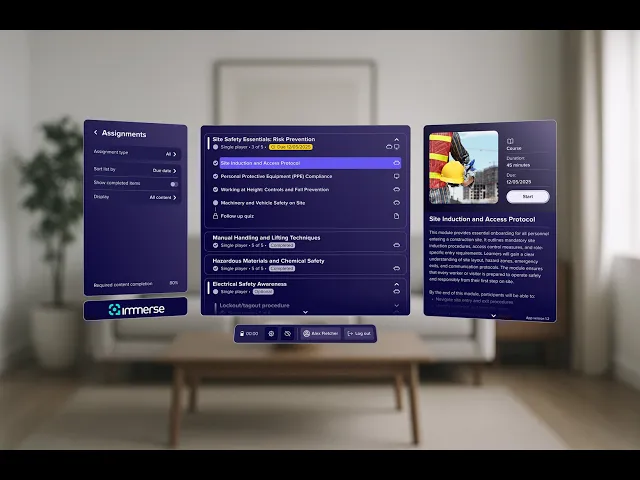
I designed a library of spatial panel layouts to support different content types, screen sizes, and interaction contexts - from short guest login flows to multi-section session browsers. Each layout was built to handle variable text lengths, dynamic metadata, and common edge cases like empty states or loading delays. Panels could be repositioned or anchored in place within specific boundaries to maintain legibility and comfort in VR. Contextual tooltips were included where needed, and each layout was tested to perform well at the default height and distance from the user in VR.
Content Categorization Redesign
We moved away from the inherited "Required, Recommended, Optional" structure not just to reduce visual clutter, but to resolve a deeper UX inconsistency. "Recommended" in particular caused confusion as users weren’t sure how seriously to take it. We dropped it entirely and replaced the static category model with dynamic metadata tags applied per item.
These Required (which displayed a due date) or Optional tags appeared inline, and users could filter by them if they wanted, without fragmenting the interface into separate views. We also redesigned completion logic so that all completed items, regardless of category, were treated the same and accessed via a unified Completed filter. This model gave users more clarity and flexibility, and worked better across varied enterprise roles.
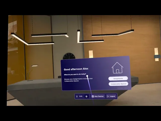
Guest & Authenticated Flows:
Designed distinct user experiences for guest and authenticated users, including screen transitions, and virtual keyboard integration for guest sign-in.
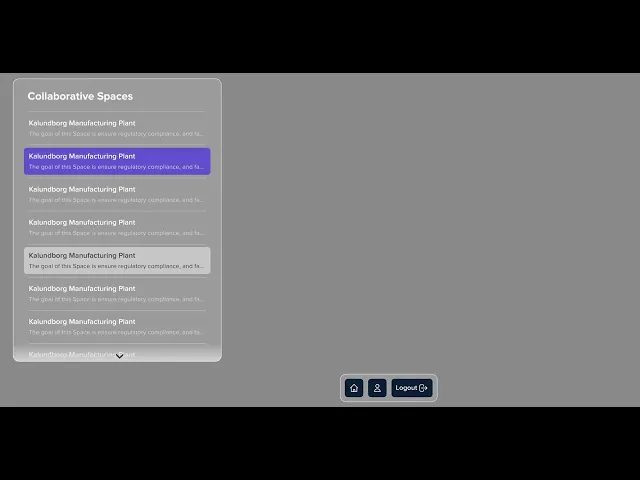
Collaborative Spaces:
I designed modular panel layouts for Collaborative Spaces, including logic for session creation, content state management, filtering, and switching between session and saved states. I also defined how participants were displayed and how content availability was communicated in shared sessions.
Theming System:
Built a live-update theming framework using dynamic tokens, ensuring visual accessibility (contrast, readability) and brand customization.
Motion Constraints:
Defined a menu movement model that reduces disorientation by constraining UI behavior within user-centric bounds.
Outcome
The Immerse App was launched in real-world enterprise settings, with support for both authenticated and guest onboarding flows. This included full deployment of the Collaborative Spaces section, allowing users to create sessions, switch between saved states, and collaborate in real time - all within a structured, multi-user environment.
The theming system I designed in Figma was adopted into production and integrated directly into Unity via JSON. This allowed clients to apply their own brand identity (colours and logo) while maintaining UX integrity. Built-in contrast logic ensured accessibility across themes.
Key UI improvements were made to the app over time, including simplified filters, more intuitive layout logic, and session state clarity. I also delivered VR-tested keyboard layouts with multilingual support.
Internally, we validated the design process through narrated walkthroughs and animation briefs. These helped communicate intent to engineering and product teams, reducing ambiguity and making the implementation smoother. The UI work from this project was then fully integrated into the Immerse SDK as part of an update to the Interaction Package.
Reflection
Notable Challenges
Clarifying the content model was a key challenge. The original "Required, Recommended, Optional" framework caused confusion, especially around what “Recommended” actually meant in practice. I restructured the system to treat categories as metadata rather than rigid sections, which reduced interface clutter and made filtering more flexible. It also required rethinking and unifying how completion worked across different user types. This process involved multiple iterations and close collaboration across design and product.
We also had to rework the visual system for passthrough mode due to Quest limitations: effects like blur and translucency weren’t viable, so we developed a fallback theme with stronger contrast and opaque layering.
Designing the theming system to scale across clients was its own challenge. Mapping Figma Variables to Unity via JSON meant every token had to be cleanly defined, reusable, and developer-proof. And in Collaborative Spaces, session switching introduced UX edge cases around filtering, saved state logic, and participant visibility that needed to feel seamless even with multiple users present.
Lessons Learned
Rapid prototyping in ShapesXR proved invaluable. We could quickly catch interaction issues in headset before they became costly. Working in tokenized design systems only paid off once we had clean, developer-ready outputs. And the more we treated documentation (like JIRA stories or animation briefs) as part of the design, the smoother implementation became.
Looking Ahead
There's a clear next step in enabling real-time annotations and markup in Collaborative Spaces, something that would take the multi-user flow from scene assembly into shared planning or review. Further down the line, voice input and predictive keyboard overlays could open up new possibilities for multilingual and accessibility-first design in VR.


